This article looks at the design trends and styles that shape the landscape of SaaS and mobile app development this year. As digital interfaces become increasingly central to our personal and professional lives, designers and developers continue to focus on offering more and more functional and visually appealing experiences. There is a variety of different design styles and which one to adopt for your SaaS tool or app (or how to mix them) depends mostly on the type of product that you are developing and the industry it is going to operate in, as well as its target users and their preferences and lifestyles. Nevertheless, let`s see what this year’s highlights in UI and product design are for the different types of SaaS tools and mobile apps. From what I have investigated, I can conclude that the design practices that will dominate the year range from minimalist aesthetics that prioritize clarity and usability (as usual), to vibrant color schemes that captivate and engage.
1. Minimalist and Flat Design
Minimalist product design in SaaS tools and apps focuses on simplicity, usability, and the removal of unnecessary features or visual elements, which helps users be less distracted from their main goals, complete their tasks more efficiently and makes the entire user experience more coherent, pleasant and straight to the point. Because of this focus on cutting or reducing the UX friction and prioritizing the user needs, the minimalist/flat product design is considered highly user-centric and you can see it applied into nearly all market verticals and types of SaaS and mobile apps.
Here are examples from different industries that are known for their minimalist design:
Productivity and Collaboration tools:
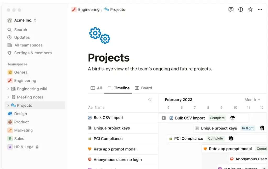
Notion
An all-in-one workspace for note-taking, project management, and task organization. Notion’s interface is clean and uncluttered, offering a flexible and minimal design that can be customized to fit the user’s needs.
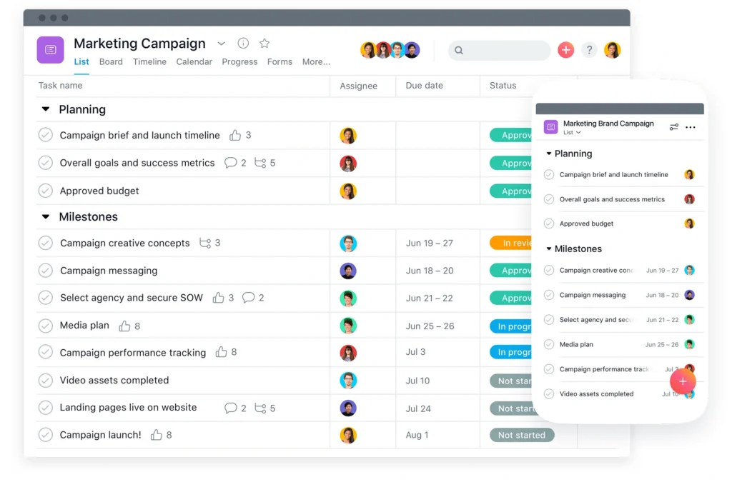
Asana
Asana is a project management tool with a clean, flat design. Its simplicity and visual project tracking elements like boards and timelines help teams plan, organize, and track work effectively.
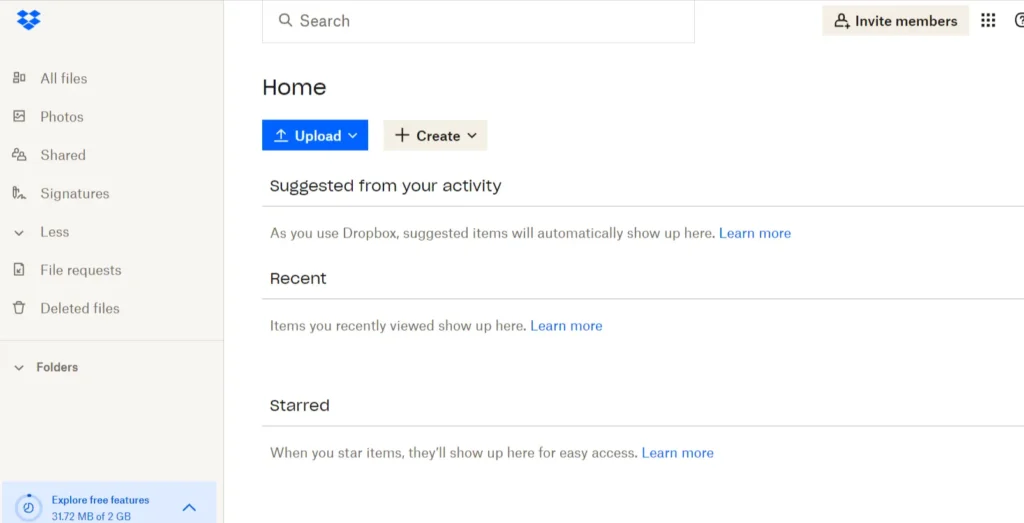
Dropbox
Known primarily as a file sharing and storage service, Dropbox offers a minimalistic design that makes managing and sharing files straightforward for individuals and teams alike.
Design and Creativity
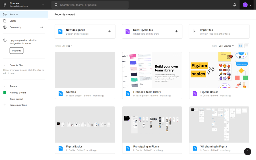
Figma
A vector graphics editor and prototyping tool that is web-based. Figma’s UI is streamlined and intuitive, allowing designers to focus on creation without the clutter of unnecessary tools or panels.
Canva
Known for its simplicity and ease of use, Canva helps users create professional designs with minimal effort. The interface is clean, with a straightforward layout that makes navigating through design options easy for both beginners and professionals.

CRM and Marketing
Mailchimp
An all-in-one marketing platform that emphasizes a clean, simple design. Its user interface is straightforward, making it easy for users to create, send, and analyze email and ad campaigns.

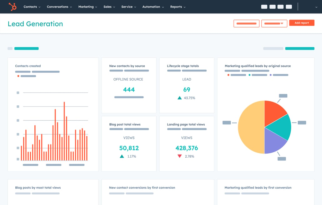
Hubspot
HubSpot offers a range of marketing, sales, and CRM tools. Its interface is known for being intuitive and user-friendly, with a flat design that emphasizes simplicity and ease of use. The dashboard and various modules are laid out in a way that makes information easily accessible.
Zoho
Zoho CRM features a clean and minimalistic interface design that prioritizes functionality and ease of use. The flat design approach helps in reducing the cognitive load on users, making it easier for them to find what they need quickly.


These are only few examples of the different market verticals that have adopted the minimalist style for their product design, but it is important to note that, because of its emphasis on simplicity, usability and clarity, it has significantly grown in popularity over the last years and has spread across all kinds of different markets and categories to become the preferred design style for saas, website and app developers. This design approach is considered to be particularly well-suited for the following categories:
- Productivity and Office Tools: Apps like note-taking, project management, calendars, and email clients benefit from a minimalist design, as it helps users focus on their tasks without being distracted by overly complex interfaces.
- Finance and Banking Apps: For financial services, clarity and ease of use are paramount. Minimalist design helps present complex information, like transactions and analytics, in a digestible format, making it easier for users to manage their finances.
- Educational Apps: Learning platforms and educational tools often utilize flat and minimalist designs to minimize cognitive load on users, making the learning process more straightforward and less intimidating.
- Health and Fitness Apps: The simplicity of minimalist design is ideal for displaying health-related data, such as steps, heart rate, or nutrition information, in a clear and accessible manner.
- Utility Apps: For apps that serve a specific function, such as weather, calculators, or timers, a minimalist approach ensures that the user can quickly and easily access the information or functionality they need.
- E-commerce and Retail Apps: While these apps may incorporate more visuals than other categories, a minimalist design can help streamline the shopping experience, making navigation, product comparison, and checkout processes smoother.
- Content and Media Apps: For platforms focused on content delivery, such as news, e-books, and video streaming services, a minimalist design can help emphasize the content itself, improving readability and viewer engagement.
- Social Networking and Messaging Apps: To enhance communication, these apps often employ a minimalist design to reduce distractions and focus on the content of the messages or posts.
2. Biophilic Design
Biophilic design in the context of SaaS and mobile apps refers to the incorporation of natural elements and principles into the user interface and user experience design to create a more human-centric, calming, and engaging environment for users. This approach draws from the concept of biophilia, which suggests that humans have an innate tendency to seek connections with nature and other forms of life. When applied to digital design, biophilic principles can enhance user satisfaction, improve mental well-being, and potentially increase productivity. As such, it is best suited for apps that focus on wellness, productivity and health whose popularity has risen remarkably over the last years due to the growing societal shift towards these aspects of life (although the design style can also be adapted to other categories as well).
Here are examples of how biophilic design can be implemented in SaaS and mobile apps:
- Use of Natural Colors and Textures: Integrating natural colors and textures into the app’s design can evoke a sense of calm and relaxation. This could include using earth tones, greens, blues, and other colors that are commonly found in the natural world, as well as incorporating textures that mimic natural materials like wood grain or stone.
- Incorporation of Natural Imagery: Images of nature, such as landscapes, plants, water, and wildlife, can be used in backgrounds, icons, or as part of the overall theme of the app. This helps to create a more pleasant and engaging user experience.
- Dynamic Elements Mimicking Nature: Integrating dynamic elements that mimic natural phenomena—such as animations that resemble flowing water, gentle wind in trees, or the changing light of day—can add a subtle but impactful layer of naturalism to the digital experience.
- Organic Shapes and Patterns: Using shapes and patterns that occur in nature, such as curves, waves, and Fibonacci sequences, in the design of the app’s interface can make the digital environment feel more organic and less rigid.
- Natural Sound Effects: Incorporating natural sounds, like water flowing, leaves rustling, or birds chirping, as part of the app’s audio feedback can enhance the user’s sensory experience and foster a deeper connection with the natural world.
- Lighting and Space: Mimicking natural lighting variations and creating a sense of open space can affect the usability and mood of the app. This includes using light and shadow effects that reflect different times of day or weather conditions.
- Wellness and Mindfulness Features: Directly supporting users’ mental health and well-being through the integration of wellness and mindfulness features, such as meditation guides, breathing exercises, or reminders to take breaks, can also be considered a part of biophilic design.
Biophilic design can enhance the user experience across a wide range of SaaS and mobile apps by fostering a more natural and engaging interaction with technology. However, certain categories of apps may particularly benefit from incorporating biophilic elements due to their inherent focus on well-being, productivity, and immersive experiences. Here are some categories where biophilic design can be especially impactful:
- Wellness and Health Apps: Apps focused on mental health, meditation, fitness, and general wellness can use biophilic design to create calming and restorative environments. Natural imagery, sounds, and themes can enhance the effectiveness of relaxation and meditation exercises, making the digital experience feel more nurturing.
- Productivity and Focus Apps: Productivity tools, time management apps, and focus aids can incorporate biophilic elements to reduce stress and increase concentration. Natural backgrounds and sounds can help create a more conducive environment for focus and creativity.
- Educational Apps: Apps used for learning and education can benefit from biophilic design by creating a more engaging and less monotonous interface. Natural themes can stimulate curiosity and make the learning experience more enjoyable and less stressful.
- Lifestyle Apps: Lifestyle applications, including those for gardening, cooking, and outdoor activities, naturally align with biophilic design. These apps can further embrace their content by integrating natural elements into their UI/UX, enhancing the user’s connection to the topic.
- Travel and Outdoor Apps: Apps that promote outdoor activities, travel, and exploration can use biophilic design to inspire users and provide a seamless transition between the digital and natural worlds. High-quality natural imagery and sounds can evoke the sense of adventure and exploration.
- Real Estate and Interior Design Apps: These apps can use biophilic design not just in their interface but also in showcasing properties and designs that incorporate natural elements, thereby appealing to the user’s innate affinity for nature.
- Meditative and Ambient Sound Apps: Apps that offer ambient sounds for relaxation, meditation, or sleep can greatly benefit from biophilic design, using natural soundscapes to create a more authentic and soothing experience.
- Workspace and Environment Enhancement Apps: Applications designed to improve the work environment, such as those controlling smart office devices or offering virtual backgrounds for video calls, can incorporate biophilic design to make digital workspaces more comfortable and less artificial.
Examples:
Calm
Calm uses nature imagery and sounds (such as rain on leaves, ocean waves, or bird sounds) in its meditations, stories, and background options to help reduce stress and improve sleep, leveraging the soothing effects of nature.

Breethe – Meditation and Sleep
Similar to Calm, Breethe uses natural soundscapes, visual elements inspired by nature, and guided mediations with nature themes
OmmWriter
A writing app designed to provide a distraction-free environment. It uses serene backgrounds and ambient sounds (including natural sounds) to create a peaceful, focused space for writing and creativity.
Noisli
A productivity app that offers a range of high-quality ambient sounds, including many inspired by nature (like forest, water, and wind sounds), allowing users to mix their own background soundscapes. This can create a more relaxing or focused environment, echoing biophilic design principles by bringing elements of nature into the digital workspace.
Forest
An app designed to help you stay focused and present by encouraging you to plant a virtual tree, which will grow while you focus on your work. If you leave the app to check your phone, the tree will wither and die. The app combines productivity with a visual representation of nature to encourage sustained attention to tasks.
3. Gradients
The use of gradients in product design for SaaS tools and mobile apps has been on the rise lately, marking a significant trend that adds depth, dimension, futuristic feel and a vibrant aesthetic to digital interfaces. This trend aligns with broader design movements that emphasize user engagement and visual storytelling through more dynamic and emotionally resonant designs. Here are some key points about this trend and examples that highlight its application:
Why Gradients?
- Visual Interest and Depth: Gradients can create a sense of depth, making flat designs appear more three-dimensional. This can help guide the user’s focus to specific areas, enhancing the usability and aesthetics of the app.
- Brand Identity: Unique gradient combinations can become part of a brand’s identity, making their products more recognizable.
- Emotional Engagement: Colors evoke emotions, and the smooth transition between colors in a gradient can create a more engaging and emotionally resonant experience for the user.
- Backgrounds and Overlays: Gradients are often used in backgrounds and overlays, offering a way to add richness to designs without overpowering the content or the functionality of the app.
- Modern Aesthetic: As part of the modern UI/UX design trend, gradients add a fresh and contemporary feel to the design, keeping the app looking up-to-date.
Examples:
Perhaps the most famous example of gradient usage in branding and app design, Instagram uses a vibrant gradient that flows from purple to orange in its logo and various elements of its interface. This gradient has become synonymous with the brand and adds a dynamic, youthful vibe to the app.
Stripe
Known for its clean and elegant design, Stripe uses subtle gradients in the background of its web and mobile interfaces. These gradients add depth and a sense of sophistication without detracting from the site’s readability or functionality.

Smule
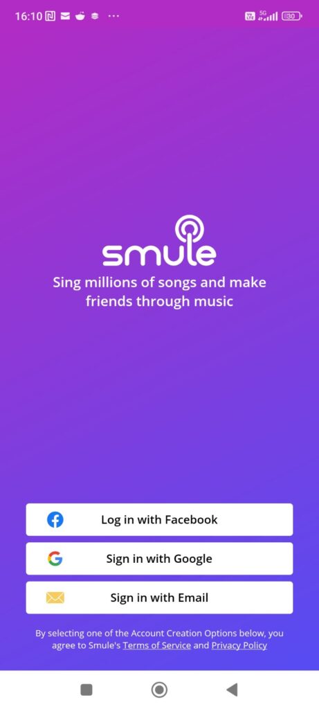
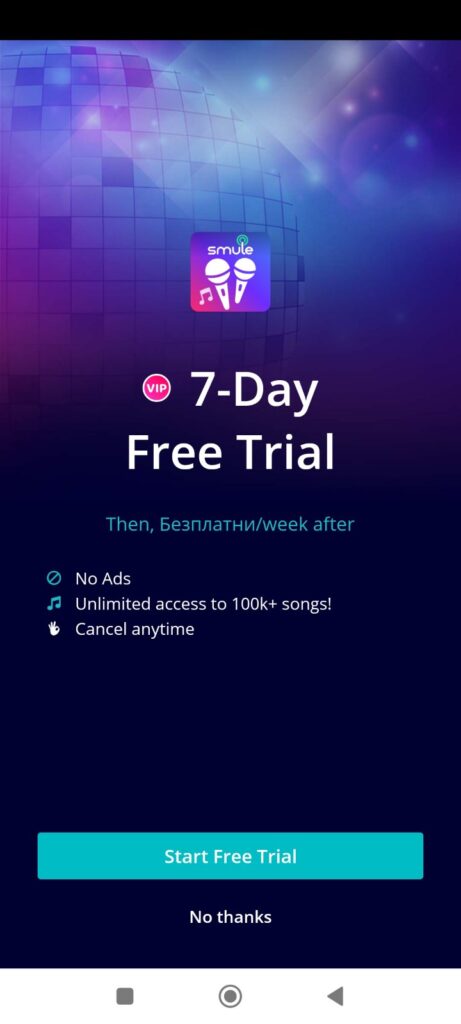
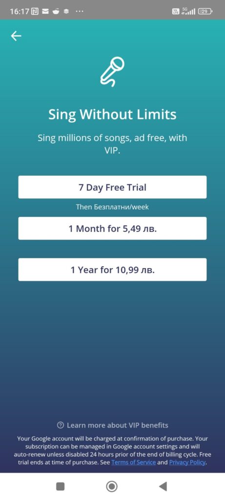
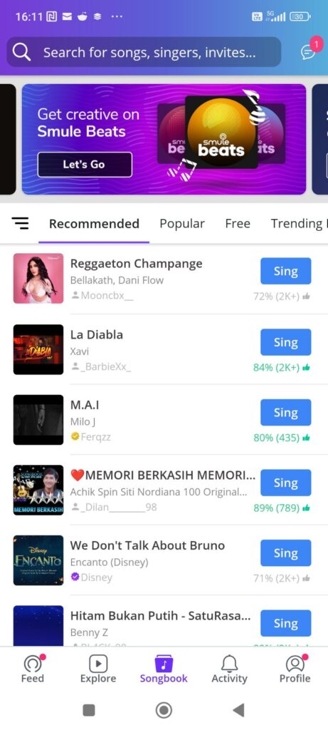
Smule, a popular social singing app that allows users to sing karaoke, record themselves, and collaborate with others around the globe, utilizes gradients in its app design to enhance the user experience, create a vibrant and inviting atmosphere, and visually represent the dynamic and inclusive nature of music and social interaction. In addition to their logo, which features a fancy gradient that creates sense of energy, creativity, and connectivity, gradients can be found as part of their in-app carousels, as backgrounds of certain loading, transition and feature (recording and playback) screens.
Revolut
Revolut, a fintech company offering banking services, has effectively incorporated gradients into its app and product design to enhance user experience, differentiate its brand, and signify innovation and modernity in digital banking. The use of gradients is a deliberate choice that aligns with the company’s positioning as a forward-thinking and user-friendly alternative to traditional banks. They utilize gradients in the following ways:
- Logo and Brand Elements
- As backgrounds in many of its screens, including the login page and dashboard. These gradients are often subtle, with soft transitions that do not detract from the legibility of information displayed on the screen.
- Financial graphs and charts that illustrate spending habits, investment performance, and currency exchange rates.
- On virtual cards and premium features
Design Considerations when utilizing gradients
When incorporating gradients into SaaS tool and mobile app design, it’s important to remember that their application should be thoughtful and strategic, focusing on enhancing user experience without compromising functionality. The gradients should be designed to be visually appealing without overwhelming users with too much color or visual noise, and should be created with the brand identity in mind. Moreover, they should align with accessibility standards to ensure that all users, including those with visual impairments, can navigate the app effectively.
4. Neon
Another trendy style that engages and captivates the user minds with its electrifying aesthetics and immersive experiences is Neon. Companies are usually applying it only to certain elements, which they wish to highlight and accent, or with the idea to bring in some colorfullness to the interface in order to achieve greater visual appeal. With its bright, illuminating and bold characteristics, it can make any design, that is otherwise focused on minimalism and functionality, stand out, look less boring and more vibrant.
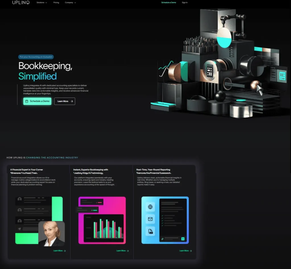
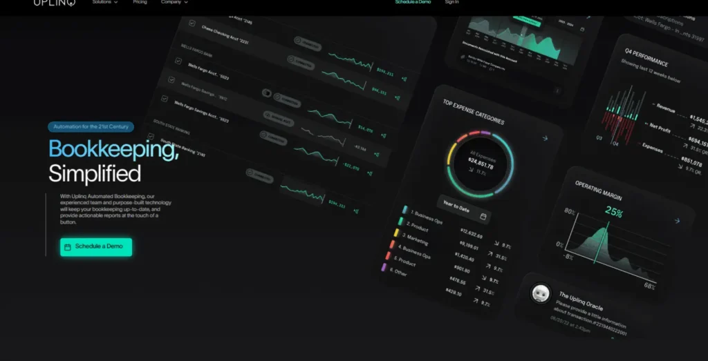
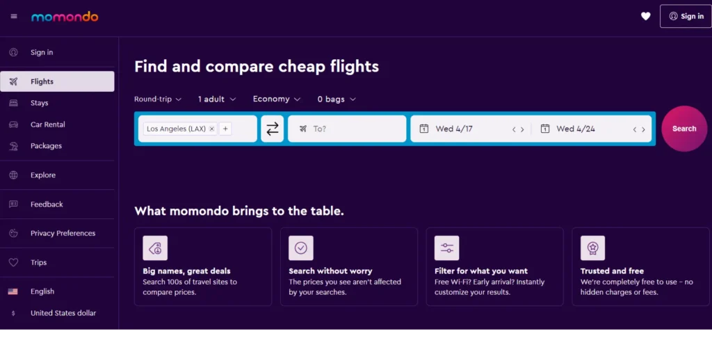
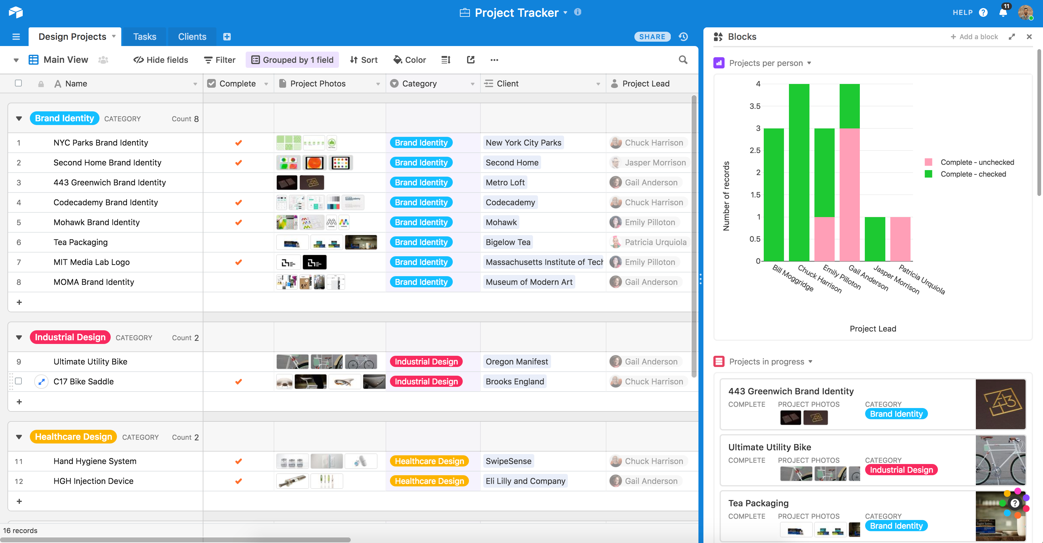
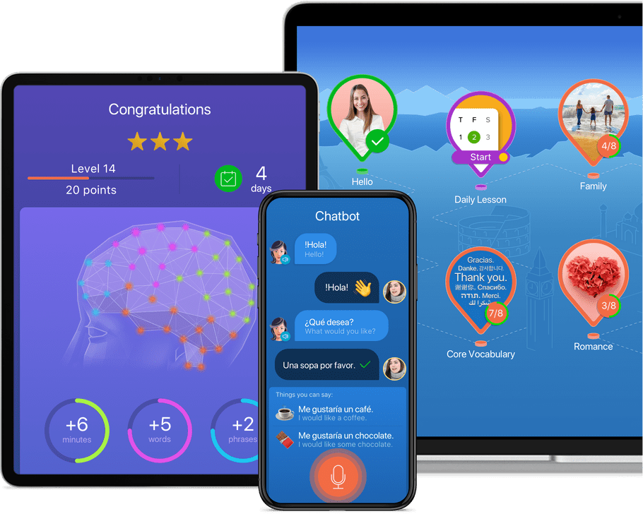
Companies like Uplinq, Momondo, AIrtable and Mondly are great examples how the Neon style can be incorporated into their UIs in different ways, to enhance their product designs and create more immersive experiences.
Uplinq leverages neon to highlight its financial analytics, using dynamic, glowing charts and graphs that transform dry data into a visually engaging story. Momondo, on the other hand, applies neon accents to enhance the user journey, guiding travelers with brightly illuminated maps and destination highlights that evoke a sense of adventure. Airtable integrates neon into its interface to demarcate different project stages and priorities, making organization not just functional but also visually stimulating. Meanwhile, Mondly uses neon to create an engaging learning environment, with vibrant colors that make language learning interactive and fun. Through these applications, neon transcends mere style; it becomes a tool for clarity, engagement, and user retention, proving that the future of UX/UI design is as bright and bold as the colors themselves.

5. Animations and microinteractions
Incorporating elements such as animations and microinteractions into the product design of SaaS tools and mobile apps will continue to shape user experiences this year. Animations are another way to create immersive and mesmerizing experiences, while microinteractions are in fact, type of micro animations (they are animations in their nature) that are triggered based on certain user interactions with the interface. The later tend to improve user engagement by providing immediate feedback, communicating system status, and preventing user errors by guiding them through tasks more intuitively. When well-designed, they can significantly enhance the usability and aesthetic appeal of digital products, making them feel more alive and responsive to the user’s actions. For those of you, who find it difficult to recall certain instances of microinteractions, here are some examples:
- Hover animations on buttons that provide visual feedback to the user,
- Pull-to-refresh actions in mobile applications,
- Toggle switches that change settings instantly without navigating away,
- Progress indicators that show the status of a download or upload,
- Form validation feedback as users type, indicating whether the input is valid.
Some real-world examples of tools and apps that have integrated animations and microinteractions into their product designs to enhance the UX, include:
Spotify
This music streaming app uses animations for now-playing visualizations, smoothly transitioning between screens, and adding a dynamic feel to user interactions with playlists and song selections.
Zova
Zova, a fitness app, uses animations to demonstrate workouts, provide feedback on progress, and navigate through the app, making the user experience more interactive and encouraging regular use.
Duolingo
This language learning app uses animations extensively to make learning new languages fun and interactive. From celebrating achievements to guiding users through lessons, animations are a core part of its user experience.
Asana
Asana, a project management tool, uses animations for task completions, loading states, and navigating through different sections, making project management feel more dynamic.
Similarly to Duolingo, one of the most delightful aspects of Asana’s use of animation is their “celebration” feature, designed to bring a bit of fun and encouragement into the task management process. When users complete tasks, there’s a chance they’ll be greeted with a whimsical animation, such as a unicorn flying across the screen, a narwhal, or even a yeti. These animations serve as a playful reward and a moment of delight in the midst of work, reinforcing positive feelings associated with productivity and accomplishment.
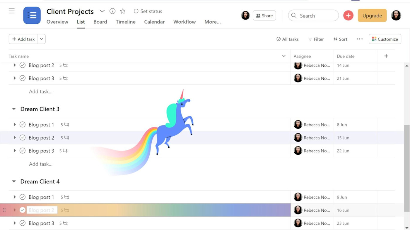
As you can see animations (as well as microinteractions) can be implemented in all types of apps and tools across various industries and markets, and as long as it is properly used and incorporated into the particular UX design in the right way, it can enhance the product experience greatly and engage the users.
